Clustering Result
The histogram above shows the clustering results of MEL in the database. According to this result, we divided MEL-related T cells into 11 categories, and the specific data can be seen in the table below.
In the following image, we demonstrate the clustering plot of T cells in BC. Different colored dots represent cells of different categories.
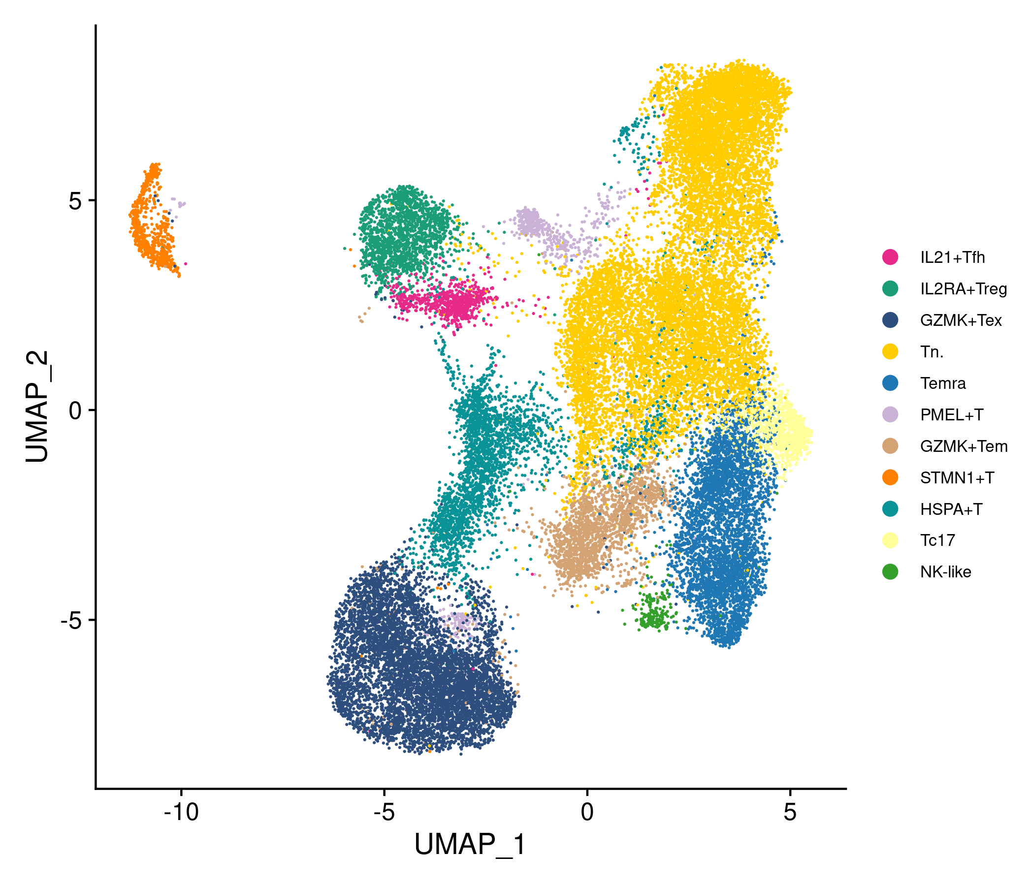
After clustering 6788 genes in MEL, their properties of p_val,avg_log2FC,pct_1,pct_2 and p_val_adj are analyzed as follows:
p_val: Positive values indicate that the gene is more highly expressed in the first group
avg_log2FC: Log fold-chage of the average expression between the two groups
pct_1: The percentage of cells where the gene is detected in the first group
pct_2: The percentage of cells where the gene is detected in the second group
p_val_adj: Adjusted p-value, based on bonferroni correction using all genes in the dataset
MEL_DataTables
| cluster | cell_type | gene | p_val | avg_log2FC | pct_1 | pct_2 | p_val_adj |
|---|